Editor’s Note: Since this is the last post before leaving for vacation (ExoB2B will be closed from July 22 to August 8), we asked Vincent Cloutier-Naud to analyze the worst website he has ever seen. His methodical analysis of this disturbing site did not go unnoticed by many on our team, who felt compelled to comment on it as well. Busybodies. Anyway, here is Vincent’s blog, followed by their comments.
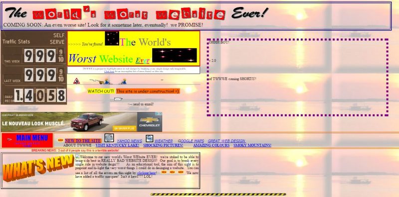
Believe it or not: Google Analytics is installed on this site! This is blatant incongruity in the middle of a Spanish paella of .gifs and horribly mismatched colours!
At the SEO level, one notices an H1 title, which is more “SEO friendly”: “world’s worst Website ever”. These words perfectly summarize what is being promoted here. I even found this site with those exact keywords, minus an apostrophe! I suspect an SEO super expert, or a deeply motivated opportunist, spent hours (ok, maybe minutes), looking through search volumes via the AdWords keyword planning tool.
In addition, we also see that the keyword meta tag is missing: now obsolete, this tag could even have a negative impact on a site’s SEO (Google sees it as an attempt of “keyword stuffing” … something that can be likened to driving a long distance, with your children asking you ‘Are we there yet?’ every 30 seconds. How does that usually end? Google says “Shut up”!)
I pop into this site on occasion, to have a look its Moz score; basically, the closer you get to 100, the better your site is referenced. Prepare to be thrown like Trump’s toupee as he gets out of his private jet: this site has a staggering score of 42/100! Holy shit! While 20-35 is a pretty common score, this site sticks it (more Trump behavior) to a lot of Web sites!
This site is like the beast from Beauty and the Beast: supremely ugly from the outside, but upon opening this monster’s big garish mouth, we discover a magnificent, intestinal flora of SEO.
For those who didn’t understand the parallel between this site and Trump’s toupee, here is a picture:

OTHER COMMENTS
Aurèle Zannou
I have to admit this site has its charm. The only thing missing is an E-commerce section where we can enter our suspended credit card information.
Anne-Clotilde Charton
“In the dark, all colours match”
The expression fits this site perfectly. The colours and animations were carefully arranged to encourage a fruitless search for anything resembling a call to action. It would only be fitting that it be hooked up to a CRM with matching performance!
Clearly though, it has in no way has affected the number of visits to the site, which thankfully are quite numerous!
Alain Thériault
On a strategic level, a website is often a brands’s admiral ship. Its look and feel, its navigation and its calls to action must be coherent.
In the context of branding, one must find moments of truth. This site is full of such small moments that confirm: you are indeed on the worst website ever.
Strategically then, this site is rock solid. If you want it to be recognized as the worst website ever 🙂
Jean Gougeon
Marc Ruel
Having studied art history for a year, I get easily excited by colours and shapes so it is difficult for me to have an objective view of this site. Here are my hastily written impressions.
My mind disapproves of what I see. It makes me sick, yet it seems quite lively and joyful. In that sense, it is sort of like the boyband called one direction.
I remember the entire World Wide Web being like this. No kidding.
The site’s colour scheme could be likened to an accident involving a truck full of Mr Freezes.
Finally, wouldn’t it be horrible if in fact this website was reality and we were its super boring dream?
Claude Malaison
Did you say Web site?? I think back to Vincent’s image of the Beast with magnificent intestinal flora. Yes, but a beast all the same as it isn’t responsive and uses a proprietary CMS dating from 1997-2003 known as Microsoft FrontPage (Ahh. Do you remember?). I actually have a practical little tool to analyse this type of site, a plug in called Wappalyzer

Vincent might see intestinal flora but we can see other internal organs, too. It’s 1.0 (FrontPage, Unix, etc.) mixed in with 2.0 like Google Analytics but unfortunately, it isn’t social at all.
You guessed it, I’m going to add in my two cents about social media and networks. This site would have be easier to look at if it was sporting some nice Facebook, Twitter, LInkedIn, Google+, YouTube, Instagram, Vine, Pintrest and SnapChat icons. And what the heck, why not some Pokémon Go?
The entire team at Exo B2B wishes you a great vacation: Hot, sunny and relaxing. Let’s all meet up again here, on August 8th!