


Clean effective design
Design is “very subjective” you like or don’t like. Web design is more than just choosing fonts and colours, it is the process of planning how content will be displayed on a computer screen, but also and more importantly these days, on mobile devices and tablets.
The objective of your site I can be to convert your visitors into customers, or get them to sign up for a newsletter or blog email. In order for this to happen you must grab their attention and get them to take action.
There are design best practices that can be observed that may increase conversions. Here are a few examples:
- Establishing a grid for element alignment and the use of consistent spacing will create an overall harmony on your homepage and throughout the site.
- Use a clear navigation menu, make sure it is available on every page, and if possible on scroll with a simple “sticky menu”
- Use visible, high contrasting “call to action” buttons when you want to put emphasis on where you want to take the visitors. As opposed to a regular hyperlinks.
- Use arrows for example to direct your visitor instead embedding actions in a text bloc will speed up understanding of where you want to take them.
- Make sure your headings, sub headings and copy blocs are distinguishable so that when you scroll a long page, you can easily see where a section ends and the next begins. Also keep the format throughout the site to maintain consistency.
- The most important design feature is to keep it clean and uncluttered giving the impression that each and every element on a page was planned with purpose.
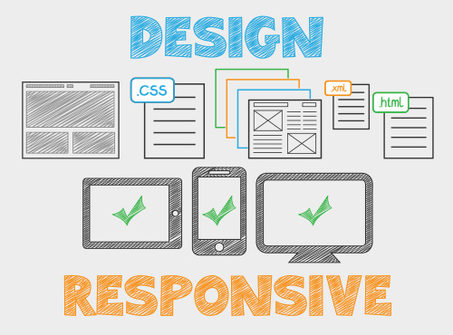
Responsive
Responsive web happens in the CSS file where you assign “@media breakpoints” so that when you land on a website your device will display the content correctly based on your devices viewport and orientation.
There are too many devices out there to count, whether it be mobile phones or tablets, laptops and desktop computers in various sizes and flavours, it is impossible to design a site for each.
To get around this, you must implement a fluid design strategy using percentages instead of fixed pixels for most of the content, but, sometimes it is not enough and a breakpoint is needed, where the specific content will actually shift around to optimize your screen real estate.
Standards are slowly being applied across device manufacturers so that the HTML code is displayed correctly and predictively from one device to another but there is always the need to tweak ever so slightly to make it just right.
If your site is not responsive, your mobile visitors will go elsewhere.


