In database analysis, quite powerful tools (SPSS, Tableau, Zoho Analytics for example) are available. However, these tools may require a certain number of hours of training and even specific knowledge, especially in statistics… what I call ‘mastering force’.

You may not know it yet, but in database analysis, you all have very powerful analysis tools at your fingertips; most likely, more powerful than you can imagine! And that is why I wanted to publish a new version of the original post with more goodies in it for you.
So, here are a more tips to help you effectively analyze a database (e.g. sales analysis) with Excel.
How to properly organize your database
To make your life easier, consolidate information into one Excel sheet.
Also, clearly identify each of your columns to find your way easily.
To be able to use Excel effectively in data analytics, use this method:
- 1 record per line
- 1 information per column
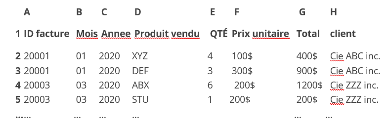
For example: you want to analyze the current year’s invoices.
Here’s an example of what not to do:
| ID facture | Date | Produit vendu | Total | client |
| 20001 | 16 janvier 2020 | 4 XYZ | 400$ | Cie ABC inc. |
| 3 DEF | 900$ | |||
| 20003 | 23 mars 2020 | 6 ABX | 1200$ | Cie ZZZ inc. |
| 1 STU | 200$ | |||
| … | … | … | … | … |
When you try to create a pivot table, you will not be able to time these results or know the quantity by product. Also, analysis by invoice won’t not possible.
Now, let’s see what you should have done:
Wishful thinking to arrive at such a structure? But no, Luke!

Excel formulas: the source of The Force
Excel offers you plenty of formulas to get you there without typing it by hand. Here are some examples of how to:
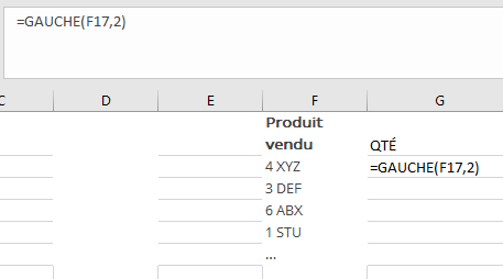
1- Separate the quantity in the Product field
- Create a new column
- In this new column, enter the formula: (= left (A2; 2))
- What it does: we tell Excel to search cell A2 for the first 2 characters. You can easily replicate the formula to your whole database by selecting the cell with the lower right corner and dragging down.
2- Try to seperate the Date field:
Sometimes it happens that instead of January 16, 2020, you have a series of numbers like this: 42385. Let me show you something awesome:
- In a cell, enter the formula = year (A2). Here, you have the corresponding date! Try with the formula = month (A2) or = day (A2) it works too!
Also separate from information:
Another function can help you. Suppose you want to separate in 2 columns of information which is structured in the same way: ex: 4 xyz, 3 abc.
It is constant: the quantity is always separated by a space.
- Select your data that you want to put on 2 columns.
- Go to Data: convert.
- Choose the option delimited, next, then check space.
There you have it, your data is automatically separated into 2 columns!

Find, replace:
This function is magic! Suppose you want to replace periods throughout your column, with commas, its simple:
- Select your data, go to the home tab then search for replace.
- Enter the value you want to search for (in this case, the “.”)
- Then enter the value you want to replace with (in this case, the “,”).
That’s it!
Once completed, if you want to convert your formulas into value, select your cells, have them copied, and then right click. Choose “Special Collage” and then choose “value” from the menu.
Use the power of pivot tables
When your database is ready, select all the data then go to the tab “Insert Pivot table”.
Click “Ok” then you will see an Excel sheet added.
In the right window, you can display the values you want in a row or column, so you can easily view online and column.
For example, sales by segments/products. You can see your product markets.
With these tables, you can even transpose everything into a graph. Not bad for your next presentations?
How about Google Sheet?
Want to share the info in real time with your colleagues Padawan or Sith? Google Sheet, for example, allows you to import data into a sheet and make collaboration easier.
And why not, a dashboard?
Need to visually submit a report? Try Google Data Studio. A free tool which allows you to create a dashboard with multiple sources of real-time data (e.g. Google Analytics, Google Spreadsheet, some social media, etc.).
Pro tip: use the ‘how to’ option…
To look like a pro, when you are looking for a solution with a formula in Excel, Google sheet or even in Google Data Studio… Look in Google!

The “Excellators” community is quite creative. And you too will eventually master Excel, like a Jedi!