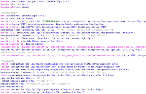
This is a trend that is definitely gaining traction for smaller and less complicated web assignments that have budget and time constraints to consider. For specific projects, it is faster to design your web layout directly in the browser, bypassing the Photoshop layer steps all together.
By using this method, you can leverage several pages coded in HTML by linking them to one CSS file. Therefore, if your client wants to change the size of the <h1> titles, the colour of the <h2> titles, the line spacing in the <p> tags, the padding or margins in your layout… etc, you simply change a few code lines in the CSS file and, you’re good to go! In Photoshop, this process is possible but more time is needed to scan and adjust a multitude of layers.
Design to browser is not possible if the web designer isn’t able or comfortable coding in HTML and CSS or, inside a code editor versus creating layers in Photoshop. These integration skills are a must in order to use this approach. Knowledge of media query breakpoints are also essential nowadays, given the ubiquitousness of responsive designs.
A third “in browser design” skill, though less important, would be the use of a JavaScript library, such as jQuery, that can add a level of interactivity and animation to your design, such as showing or hiding content with an accordion, page scrolling… etc. This is a more advanced level of coding and can add a nice touch to an otherwise static web presentation. This however, is something that cannot be done in a Photoshop document.
Don’t get me wrong, Photoshop is my favourite tool, hands down. You simply cannot leave Photoshop closed all together because there will be the need to resize and crop images and logos. Also, more intricate design elements are impossible to produce in CSS alone, so Photoshop will remain a faithful design partner for every project.
The big advantage of designing directly in the browser is the possibility of a quick turnaround in a tight timeframe. Your client will also get a feel of the site’s responsiveness versus the static presentation of a PSD file.
This design approach is not practical for every project. It should be reserved for smaller, less complex web sites or even mass email campaigns, especially for those projects that must be delivered… “yesterday” !


